11th Place, wow. Not sure why you wanted a critique on this photo, it obviously struck a cord with the voters. Here goes.
What this photo has going for it:
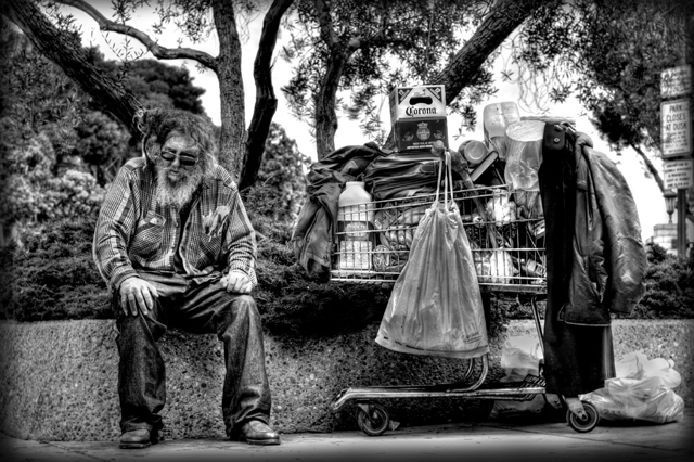
You managed to use the frame in nearly a perfect way. Equal parts left/right and the tree branches spreading lines out. Very nicely done. The choice of B&W was good here, as these types of shots get a little too busy with color. The shot is well processed with a nice high contrast large tonal range. The various shapes also is a nice touch, circles, squares, lines, etc...
Scoring better:
Can't really add much here as anything above a 6 generally would just be nitpicking. I would think this photo would have done even better the Poverty Challenge.
Things to consider in the future:
Some things I would like to see. Maybe tone down the brights/contrast just a bit I think this might bring out the tonality better. Lastly, not sure if you thought this would do poorly? If you think a photo might do as well next time you might refrain from the critique club as it is probably less beneficial to you than others.
To Sum Up:
Personally, I think it is a wonderful photograph with a lot going for it. 6.1 is a terrific score and you should be happy. I don't really have much to offer in terms of improving the photo. The last part is more of a reflection what I like to see in a shot and is a matter of personal preference and in no way impacts this wonderful shot.
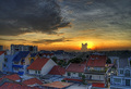
Very surrealistic look to it and very nicely edited. Just not sure that it screams suburbs to me. Seems that I'd see this more on an urban street than a suburban street?
One of the three I think should and will ribbon! My only gripe is that the contrast seems just a little too sharp, but then again i'm still giving you a 9... so what do I know? =)





 Add photograph to your favorites
 Add photographer to your favorites


 Photographer found comment helpful.


