This image has a lot going for it - I'm surprised it didn't finish higher. But as you know, there were a great many excellent entries to compete with.
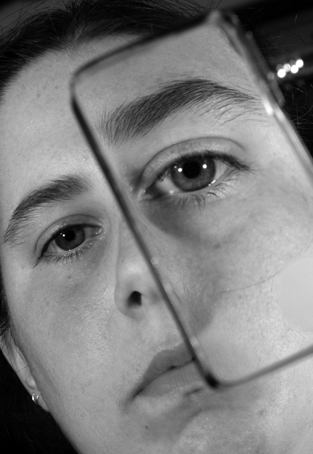
One of the common weaknesses of many entries is the lack of impact - but your image does not suffer from that. It reaches right out to the viewer and shouts "proportion" quite loudly. I don't necessarily agree with the comment that it "barely" shows proportion as the left eye is about 1.5 times the size of the right eye.
Your presentation is well done - placing the subject on a diagonal line adds some tension.
Techically, the exposure looks to be right on and the "printing" shows good black and white qualities - good clean crisp whites and some black blacks with a nice tonal range between.
I'm a bit confused by the tech data shown on the image - an f-stop of 2.8 and a shutter speed of 1/10th. I would not have thought the focus on the right ear would have remained sharp at 2.8 - given the focus is most likely centered on the eyes. And a shutter speed of 1/10 most lkely required a very still model and a tripod.
The lighting is a bit "troublesome" as well - with two catchlights in the larger eye - but just one in the smaller one.
The only minor improvement I would suggest is the removal of the bright spots just to the right of the eyelid and in the upper right corner of the image.
I like the attempt here and it is out of proportion, but just barely so...I would like it more out of proportion....make a great human abstract that you really don't see a lot of. Good work.
Interesting take on the challenge. Nothing to critize photographically. Perhaps add more background for context, but I think this is pretty good as is.
The composition is ok but I wonder if it would be a more startling image if just the eyes were cropped. I can see how it was problematic to make the decision on just how to present it. Clever idea.





 Add photograph to your favorites
 Add photographer to your favorites

 Photographer found comment helpful.


