|
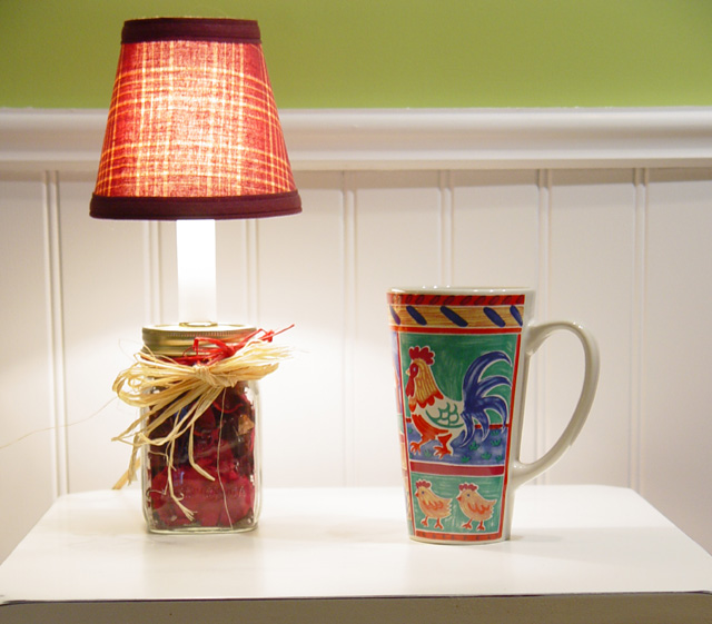
Good idea, but weak presentation. The composition is staic. That chair rail in the background doesn't help. Even without finding another setting, this composition could have been improved by placing the two objects closer together, and cropping in close, to make a vertical image. This would make the verticals stronger than the horizontals. Right now, they are even. As this image is, you can improve it by cropping all the dark off the bottom, and coming in as close as you can on the sides. |






 Add photograph to your favorites
 Add photographer to your favorites


 Photographer found comment helpful.


