Although I already commented on your image during the challenge - it's nice to see what others have said and see if we can come up with a consensus.
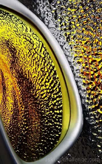
First - it's a great image - coming in 29th in a very competitive challenge. The major things that pushed it up there are: a) Superb Colors, b) Superb textures, and c) Perfect exposure.
On the downside, a few commenters, including me, had some difficulty with the composition. I don't know if you've had any "art theory" classes, but they have actually "measured" viewers eyes to see where the eyes "go" inside an image - and the path to get there.
In America, and other countries where they read from left to right, the studies show that images which have a "lead-in line" starting at the bottom left or so - then take the viewer into the image - rate higher more consistently than those that don't. Of course that's not a hard rule saying there should "always" be one. (The study I am familiar with did not comment on countries that read right to left.)
So - since you do have a lead in there - note that it takes you diagonally up and to the left - and out of the frame. That's why I commented earlier that if you included the bottom of the lens shape, it would do better.
I know I've used a lot of words to say very little, but when the image is as close to "PERFECT" as yours, sometimes it's nice to know the theory behind what commenters are saying.
In any event - keep up the good work - and I definitely predict you'll be on the ribbon list(s) very soon. I loved your entries in Still Life and Proportion.
I like the glossy sharpness and the color very much, but the composition feels a little awkward to me. The lines draw your eye out of the photo instead of keeping you focused in it.
Composition: Subject Placement, Cropping, Background 8
Technical: Focus, Exposure, Lighting, Processing 9
Appeal: Is it Interesting, Motivating, Etc.? 10
How well does it meet the challenge: 9
Total Averaged Rating 9
one of my favorites this challenge
Since you're having so much trouble with this shot, I thought I'd stop on in and comment. First off, I'm not a huge fan of abstracts. That being said, this one is alright. The color is what does it for me. I like the texture and patterns along with the color. Had I not gotten some inside info from the DQ request, I would not know what this is, but that's ok. Maybe that's what makes it interesting. The way you have positioned the sunglasses in the photo makes for a nice balance with the reflection and colors. Good luck in the challenge. ~Heather~
The colors are marvelous asare the textures. Compositionally it is a bit unnerving for me. I think I would be much happier about it if I could see the rest of the large gray/silver shape at the bottom. It may also be stronger if the grey/silver shape were positioned a bit more CCW in the image. Overall though - this is a very stong submission, it should do well.






 Add photograph to your favorites
 Add photographer to your favorites

 Photographer found comment helpful.


