Author Thread Comments Made During the Challenge
Post actions
Blurry, and black and white doesn't quite do it. good luck:)
Post actions
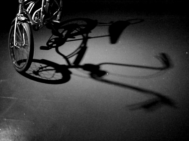
What a switch. See all of shadow and only little of subject. Well done. Adds something different to photo. Good lighting and especially good use of shadow
Post actions
Cool shot! If you could have cropped out the bright spot in the bottom left corner, it would be even more dramatic.
Post actions
Post actions
The concept here is quite good... the image quality, on the other hand, is weak. - setzler
Post actions
just not very interesting.
Post actions
cool idea. it need a bit more of focus or resolution. : )
Post actions
I'm not sure the framing is effective here. I think the bike might be better if it were a little bit more in the frame, and a little bit more in the light to cast a more complete shadow. A sharper shadow would also have helped. The subject doesn't really impress me either. 3 wingy
Post actions
very well composed shot. Nicely framed. Very original. Missing alittle soemthing. And it seems blury (is it the jpg compression?). 6
Post actions
The shadow is awesome, crisp and clear. The bike looks oversharpened to me. Great idea. karmat
Post actions
It seems blurry, not sure if that was your intention. I like the black and white.
Post actions
Shine on the lower left is a bit distracting. This was a good idea, creative shot. Justine.
Post actions
Was this shot on a steady platform? It looks like camera shake.
Post actions
The negative space at the bottom seems uneccesary







 Add photograph to your favorites
 Add photographer to your favorites


