|
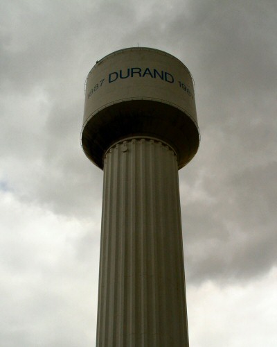
A good idea but without the title it really doesn't make sense for the challenge overall. Also the lettering on the water tower (it is a water tower, right?) also takes away from the illustion you were trying to create. The duotone in the shot is also a bit dark and forbidding, I'm guessing you went with that because of the cloudy day. I think black and white might have worked better with this shot and if you could have had a hand in there holding the base of the tower that would have really made this shot and fit the title better. Contrast is also lacking to me, it seems flat and doesn't really grab my attention. Started at a 4 but am raising to a 5 |





 Add photograph to your favorites
 Add photographer to your favorites


 Photographer found comment helpful.


