Author Thread
Post actions
Comments Made During the Challenge
Post actions
Good idea, quite funny. I like that it is black and white. I wish it wasnt so dark at the bottom though. (9)
Post actions
interesting photo.....I like it!
Post actions
Post actions
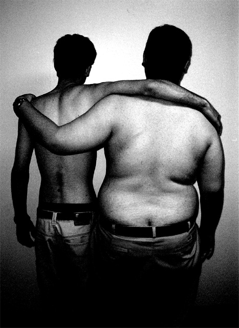
A wonderfully simple and understated choice. I like the black and white - it allows us to concentrate on the differences in size instead of flesh. I wish the left fellow was a little better lit across the lower back.
Post actions
This one wins for me. It has a rawness, and suits the challenge very well. My congratulations.
Post actions
Excellent! And I even like the grainy image
Post actions
For some reason i like it. (8)
Post actions
Is this a plumbers convention? Actually not a bad idea. Good treatment of the challenge. Better lighting all around would help though.
Post actions
This shot has potential. I like the idea alot but the technical aspects of the shot are not very good.
Post actions
Post actions
This is clever! I wish that either the bottom didn't fade into darkness, or else that the top did - more even lighting, I guess, is what I mean. But overall a creative shot with lots of human interest for the viewer. 7
Post actions
great shot! Nice concept.
Post actions
Boy has some of the sand shifted! Great idea and execution! Graineness adds a nice touch.
Post actions
great shot-wish it wasn't so grainy
Post actions
Yikes on the butt crack! otherwise clever idea - B&W works as does the dark, grainy feel
Post actions
Grainy image !! perfect! well done Your title stinks IMO but I dont vote on titles
Post actions
You stole my idea! Good thing I ended up submitting something else :)) Nice job, down to the "crack" of it.
Post actions
The idea here is really good and the pose of the two subjects is great. The overall photo though is too grainy and the lighting is too spotty. Maybe you did it deliberately and it just isn't my taste but I would like a different texture. 5
Post actions
Very nice shot, I particulary like the way you lighted the scene, it seem to bring the two pitures together. one thing though.. its small I know, but I find it a bit out of place.. the watch.
Post actions
That is what proportion mean to me.... but i dont like the noise
Post actions





 Add photograph to your favorites
 Add photographer to your favorites

 Photographer found comment helpful.


