Wow some people really know how to make someone who is new feel like crap and never want to enter a challenge again. I will be sure not to come back soon
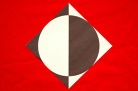
This would have been almost perfect for the abstract challenge. Not really sure how it fits into this challenge. The size of the shot really hurts, if you could bump the size up, that would really help. Also the red cloth is wrinkled and pulls my eye away from from the main subject. The subject looks more brown and white than black and white (I'm guessing you were going for black and white) and yes, my monitor is calibrated. The overall composition and croppping of the shot is well done. A 3
The color choices on this are excellent, but I honestly can't tell what message you are trying to send. Is this perfectly proportioned or completely lacking in proportion? I think to make this strong, you might think about an object for reference size wise.
"Confusing"? Yes, it IS confusing! ;-) Not sure how this fits the proportion theme? Picture-wise, it needs more contrast and the red background shows wrinkles. Also, the image is too small.







 Add photograph to your favorites
 Add photographer to your favorites


