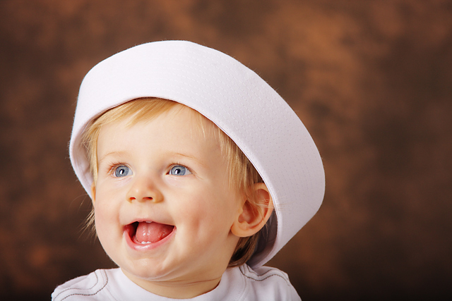
This is so damn cute! I love that the wee hat is too big and that happy little smile, little dimples too! It's so natural, just like a kiddie portrait should be.
Really nice. The only thing I would do different is to crop out some the negative space on the right. I’ve found that if you are going to place the subject off center, have the extra space on the side that they are looking, moving etc. For me it adds a sense of curiosity, it teases me with what they me be seeing or where they may be going. Still it’s top notch and I’m sure it will me prominent in the family photo album.
I might have cropped this off of the right a bit to have this BEAUTIFUL baby seem to be looking into the frame a bit more (instead of out).
Perfect focus, lovely light, and the background is good.
I love those little teeth, that dimple, and that smile! :)
Nicely done. I would have cropped a little differently though. Usually you want to have the most negative space in the direction the off-center subject is looking because you eyes tend to want to go in that direction too. Perfect lighting and contrast on your backdrop.
Cute expression, but the composition just missed in my opinion. I don't like the negative space behind and right. Fantastic lighting, nice bright eyes. The parents will love this.






 Add photograph to your favorites
 Add photographer to your favorites


