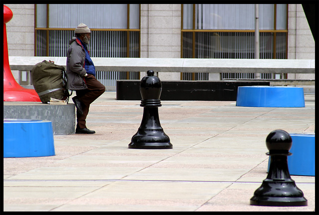
Interesting on many levels. Good social commentary, nice lines, good colors. I'd be very intereded in knowing if you posed this, since his jacket and shirt match the reds and blues around him. Very good.
Really nice shot -- should rank well. I'm a little disapointed with the funny black triangle in the upper-right corner. It seems that a step or two forward or backward (to include it as an element) would have been advisable.
Nice title and composition. This is one of my top picks for the challenge. The only issue I have is the top right hand corner. I imagine it part of a tall chess piece. Maybe if you would have moved left about 5 feet you could have avoided it. Good luck!
Compostion is very interesting. The chess pieces really look huge thanks to the inclusion of the man. The shiny highlights on the subjects gives you a great sense of the structure and curves that make up the shapes. "9"
Beautiful...... nice composition.
The top right hand corner is a little distracting .. .could do without it..
The cropping of red object on the left is a little too much.. would be nice to show a little more of the red object... still a 8 for me
Go Philly....totally forget about this.....If I had remembered I might have stuck a shirt on the giant iron Monopoly piece....wow....how dumb was I. Nice touch including the person show the proportions.....Go Philly! RoB
Very clever composition. This could be used for a textbook example of how to position objects within the frame. It's composed in a nice dynamic line, and the eye is actually led from front to back, as if looking into a 3-D scene. (The little triangle up in the right corner is a distraction, but other than that, it's perfect.) Great colors, contrasts and human interest.






 Add photograph to your favorites
 Add photographer to your favorites


 Photographer found comment helpful.


