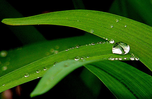
Thanks to everybody for voting and commenting! Everybody who remarked the out-of-focus blade was right: I simply didn't dare to touch the subject or move in fear of falling of the drops!
Lovely demonstration of proportion - the different sizes of the drops of water, with the largest one pushing its boundaries. Nice color saturation. I find the out of focus blade in the foreground a little distracting to the overall composition. Very nice ... gives me a soothing feeling.
I really like the color and the compositiion. The choice of focus works good for me as well. It does look to be a bit over sharpened however. In any case I really like this image.
Your colors work well for me here. I don't know why but the leaf in front being out of focus is a little disturbing to me. Overall , I like your image.
Lovely, rich color. Beautiful detail on the droplets. Nice texture. Good use of negative space. The only disappointment is the foreground leaf because it's in the center and out of focus, and because it hides some of those wonderful water drops.






 Add photograph to your favorites
 Add photographer to your favorites


 Photographer found comment helpful.


