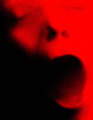
With an hour till turnover I believe I have a personal best in number of favorites during voting (7). I didn't expect this to even score a 6 let alone get all those favs so it's a welcome surprise.
Btw, Bear_Music's comment is on point with what I was trying to do here. My thought process was to convey "abstract emotion" and not "abstract + emotion" or "emotional abstract" which I'm sure was what most people interpreted this challenge to be, which is fine of course. FWIW, I did take some abstract looking photographs using paint similar to what LevT did a while back in an abstract challenge but to be honest it felt more like creating a painting than photography so I didn't enter those.
*Post*
Wow I think I need to marry that scrubbing machine. It was at 6.37 with a minute to go and finishes at 6.54. Easily the biggest difference I've ever seen since submitting. Thanks for all the kind words and favs.
Outtakes:
Editing Notes:
1. Boost detail in this case I used LucisArts and Color Efex Pro Tonal Contrast combined but it could have been done with Photomatix or Shadow Highlights + a contrast or curves adjustment.
2. Turn day into night by shifting tones towards blacks in a controlled manner using masks on curve and exposure adjustment layers. Almost all of my dark imagery starts out very bright so I have good detail in the shadows to start out with.
3. Dodge and burn
4. Finalize color using curves and hue/saturation
5. Clean up imperfecions and smooth out tones via healing/cloning/blurring.
Statistics
Place: 3 out of 140 Avg (all users): 6.5448 Avg (commenters): 7.9667 Avg (participants): 5.8710 Avg (non-participants): 7.0482 Views since voting: 6760 Views during voting: 327 Votes: 145 Comments: 69 Favorites: 35 (view)
I love working in black and white and dark tones. Ooooooh I'm so envious!I've gotta try to decipher your editing notes. LucisArts is one of those programs I hoping to buy. Hmmm I'll have to try out the Efex plug in you've mentioned. The clarity/detail is outstanding. Thanks for sharing. Much success.
Congratulations! Very cool feel to this image. Nice textures and lines and - of course - those great Yanko tones. I love the little lone tear droplet in the upper left. I see that the splash of yellow was sorely needed on your profile page too....well it's FINALLY there - phew! : ) Very well done. {BTW...I'm comin' to get your average Baby!}
I just love this shot!! Abstract? I'm not sold on the fact it is an abstract. BUT .. I would love to see this hanging in my kitchen. I hope you offer it as a print. If you do please PM me and let me know. Congrats on your ribbon!
I have no idea what you said there in the "processing steps" - I just know it has that wonderful patented (or should be) Yanko toning to it. Toning to die for, I might add. Very good tip, though, on turning "day to night" - will have to play with that to see if I can get anywhere close. First I need to shoot something properly exposed and focused, THEN I'll try. Very nice work. And I LOVE that red/blue abstract, by the way.
Wow.... This is extraordinary... I'm not sure, frankly, if it's dealing with an "emotion", and it's anything but "abstract" on the surface of it, nut nevertheless the assemblage DOES seem to represent the abstraction of an emotion. It's an interesting issue, since an emotion, of itaelf, IS essentially abstract, and an abstraction of an abstraction ought to be a specific, just as two negatives make a positive. Whatever... This is extraordinarily beautiful...
1. Boost detail in this case I used LucisArts and Color Efex Pro Tonal Contrast combined but it could have been done with Photomatix or Shadow Highlights + a contrast or curves adjustment.
2. Turn day into night by shifting tones towards blacks in a controlled manner using masks on curve and exposure adjustment layers. Almost all of my dark imagery starts out very bright so I have good detail in the shadows to start out with.
3. Dodge and burn 4. Finalize color using curves and hue/saturation
5. Clean up imperfecions and smooth out tones via healing/cloning/blurring.
congrats - but i think you could have had it all, abstract, photographic, water drops... if youda just cropped a bit ;-) hmm, i gotta get your tritone recipe one of these days....
I thought about stacking everything in one spot so that the knife was underneath the onion and it looked like it was all one jumbled mess. The water would be splashed on the outside of it like it was poured/dropped from a distance a la Jackson Polack but forgot to shoot that version
congrats - but i think you could have had it all, abstract, photographic, water drops... if youda just cropped a bit ;-) hmm, i gotta get your tritone recipe one of these days....
Ahhh, Richard...I just LOVE this photo...you know why?! Instantly, I was captured but then had to think about why...the water on the knife and the reflection within carries the abstract emotional impact as the heart of this photo for me. As always, exceptional doesn't begin to describe the beauty of your work and this photo does not disappoint your fans!!! The emotional within the mundane! (I was a little disappointed not see any UFO's though...;-P...) Many congrats on your ribbon!
Now that the show is over and I can read what everybody else had to comment, I'm glad to know I was not the only one. Like I said, it's an awesome photo. Maybe the DPC stands for 'contest' after all? Congrats - I guess...
Water drops fallen from eyes irritated by a chemical reaction is an abstract of an emotion? Even reading your notes I can't make the connection. Fine looking shot to be sure. I'll have to puzzle out the rest on my own.
Certainly an abstract method/concept to potray emotion but the shot, no matter how much I like it, must stretch the imagination to see how the shot looks abstract. Guess people can abstractly interpret the challenge description ;) I think many voters want to see an abstract photo first(in appearance not concept), then get hit with the emotion. In that sense I think points will be shaved off but many will enjoy viewing the shot and like the concept behind it and will probably come back to bump it up. Love the look of this image and it's an A+ in that sense. Great shot to have in one's portfolio. oh and +faved it the moment I saw it so it connects very well.
This does not seem abstract to me at all. However, I gave it an extra point (above my usual DNMC) because I like it so much. :) The processing is wonderful. The crop fantastic. The textures... magnificent. The water... a touch of genius.
If this were in Free Study or on topic, IMHO, I'd give it a 9 or 10. As it is... not abstract in my opinion... I have to give it a four. And I'm bummed about it. *sigh*
7 - Good strong clean image - like your finish/processing. Tones are good too. The 'tear' seems oversized - but perhaps adds to the overall 'oddness'. Excellent composition .. although maybe a little less knife/knife handle for added 'abstractness'... who knows.
Wow.... This is extraordinary... I'm not sure, frankly, if it's dealing with an "emotion", and it's anything but "abstract" on the surface of it, nut nevertheless the assemblage DOES seem to represent the abstraction of an emotion. It's an interesting issue, since an emotion, of itaelf, IS essentially abstract, and an abstraction of an abstraction ought to be a specific, just as two negatives make a positive. Whatever... This is extraordinarily beautiful...





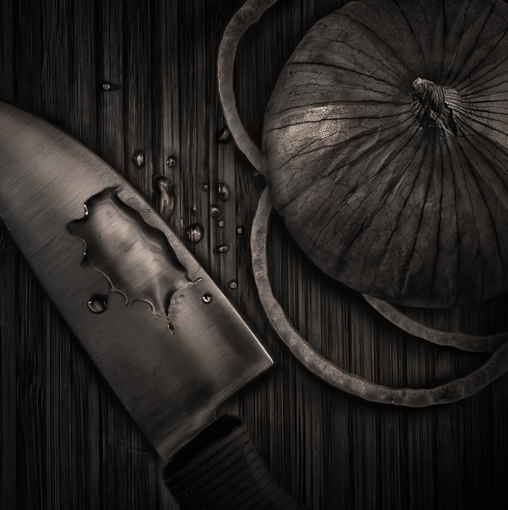
 onion tears
 Add photograph to your favorites
 Add photographer to your favorites


 Photographer found comment helpful.


