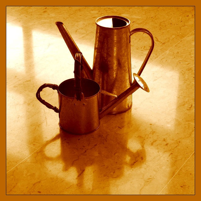
Thank you everyone for the useful comments. You're maybe right, I should have not add the borders or at least not of this colour. Until now this is my highest rated picture and I must say I'm pretty much satisfied with it. Have a great day whoever you are wherever you live !
Alex
This photo is a real beauty! Well-tempered colour-tones and a composition on the edge of what could be accepted/expected. I'm sorry to say that the border is dragging my impression down, and also the points given...
the title makes this a really great pic, really made me laugh, i often see objects as characters which throws a completely different slant - 9 from me - good luck
Nice idea. Colors work well together; the diagonal lines of the floor add impact. I don't particulay like: a) The placement of the watering cans in relationship with each other (the mergers of the little can's sprinker head with the handle of the larger can and the little can's handle with the larger spout) b) the border detracts.
I don't find this a pleasing arrangement of these two watering cans. If it weren't for the title I would wonder why you chose to place them like this. This just doesn't work for me.
Composition: Subject Placement, Cropping, Background 5
Technical: Focus, Exposure, Lighting, Processing 5
Appeal: Is it Interesting, Motivating, Etc.? 4
How well does it meet the challenge: 5
Total Averaged Rating 5 Autool






 Add photograph to your favorites
 Add photographer to your favorites


 Photographer found comment helpful.


