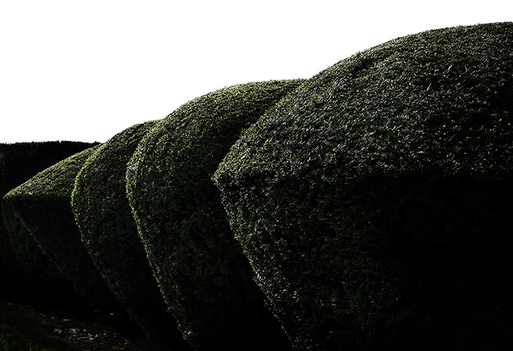
This was the one that really stuck in my mind after an admittedly brief perusal of the entries. It wasn't the Sartre (though I loved skewsme's link), it was the relentless topiary! You found the right angle and colour treatment to bring it on home.
very apt - the washed out sky, bulky shapes and lack of saturation (without being a crisp b/w) all work perfectly together. (i wonder though, in France, is ennui thinner?)
with congratulations, or perhaps in commisseration..? i offer my favorite sartre link
At first, it did not make sense and I scored it a 6. I felt it was rather boring, not quite abstract and somewhat emotional. Then, like a good dpc'er should be - I looked up what I did not understand.






 Add photograph to your favorites
 Add photographer to your favorites

 Photographer found comment helpful.


