I've never seen this photo, but I love it! There is so much going on in it, I could look at for a long time. I look at the score and have to wonder. Favorite for me!
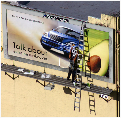
beautiful! would have qualified for serendipity too! I love the color difference between the two billboard designs and the darkness/definition on the arms of the man putting up the sign. The shadows really help to make it. I find the rooftop a little distracting, but a wonderful entry. good luck!
i love this photograph.
This shot has had 4 different scores from me ranging from 6, to it's final position as my only TEN.
Good luck. This is my favorite and i hope it wins.
I really like how I can't tell immediately from what angle I'm looking at this scene. It's got a lot of "confusing" imagery, I think, but it's interesting.
Good subject choice - really represents proportion well. I like the angle of the photo and the fact that you've chosen a billboard on a building, as opposed to a freestanding one. It eliminates messy background noise. Classy border, too. 9.
Good eye, this shot could be in one of the larger newspapers or newsweek or something. Probably will not score very high here (like the grade stuff at DPC), but it's very good.
This is a great illustration of the challenge theme! I like just about everything about it. It would have been nice if the worker were a little brighter--he gets a tad lost in the color of the billboard, but other than that, I think it's a great shot.





 Add photograph to your favorites
 Add photographer to your favorites

 Photographer found comment helpful.


