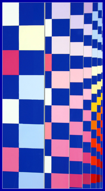
the frame and its color was perhaps not well thought out...black would have done much better and no frame even more so. I like the colors and the abstractness to the far right very much. The large amount of pink varigations, too many pastel like in shade, do nothing for me.
Colourful OP Art..... extremely good, effective and makes the eye move! I enjoy the vertical presentation of frame which emphasizes the grey dividing lines of the receding stacked grids. Colours are wonderful.






 Add photograph to your favorites
 Add photographer to your favorites


 Photographer found comment helpful.


