probably loads of people with the same idea but don't care liked it so. . .
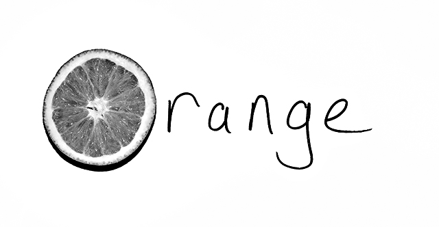
taken in my kitchen using wireless side flash, tried direct flash so there were no shadows but liked this as it gave the orange more definition, used a green filter to make the orange stand out. cropped converted to grayscale using nik silver thingy then curves and save for web.
Statistics
Place: 69 out of 240 Avg (all users): 5.5444 Avg (commenters): 8.7143 Avg (participants): 5.0448 Avg (non-participants): 5.8725 Views since voting: 1068 Views during voting: 299 Votes: 169 Comments: 12 Favorites: 1 (view)
Hmm, I guess I didn't get around to commenting on this one while voting - I loved it, gave it an 8 and am surprised that it didn't do a lot better. Thought it was a very creative take on the challenge.
The concept is good, but the execution leaves me a little wanting. It appears to be a handwritten paper sign with an orange on it, which is exactly what I suspect it was. But you want to make me *think* it's fancier than that. Yes, a shadow helps - have MORE of one, but elongated beyond the orange. Watch the highlights on the surface of the orange itself. Have a bit of an angle, to get some depth of field to the shot. It doesn't feel like a photograph - it feels more like a digital kinda thing where you stuck a picture of an orange in with the letters. Hopefully some of this is helpful to you - none is meant to be hurtful! I didn't get this one in voting - to be honest, I'd probably give it a five. But the folks who liked it REALLY liked it, as you can see by the commenter average!
Clean, sharp and to the point. I do hope this one does well as it is one of my favorites. I really like the idea and adding it as a favorite as well.....






 Add photograph to your favorites
 Add photographer to your favorites


 Photographer found comment helpful.


