|
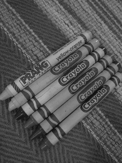
The image seems a bit too gray. Upping the contrast to add more white and more black would make everything stand out better. Since most westerners read from the top left to the bottom right, the eye sees it as strange when text is angled the opposite way. |





 Add photograph to your favorites
 Add photographer to your favorites


