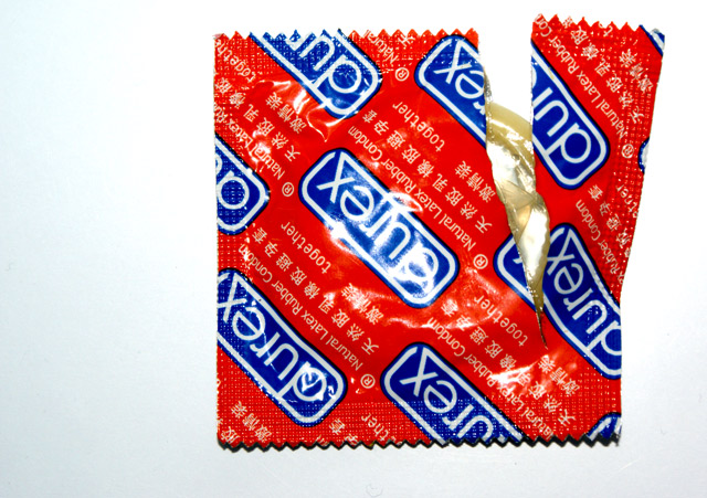
The lighting used here is very harsh, and that combined with the arrangement of the subject make this image very 2 dimensional... might have tried taking it with a light other than the on camera flash, and perhaps from an angle other than from directly above. Also, from a product POV, it would have been better to have the brand name around the right way, or somewhat close to it.
Popular theme, the condom theme! Focus and color are very good, light a bit harsh. The composition is bit flat to me - not sure what I'd recommend, other than maybe more white space or less of a top down head-on kinda shot.
I really like the boldness and vibrancy of this, that glare in the middle of the packet is a bit distracting but I know from experience that it's near unavoidable with a shiny wrapper!






 Add photograph to your favorites
 Add photographer to your favorites


 Photographer found comment helpful.


