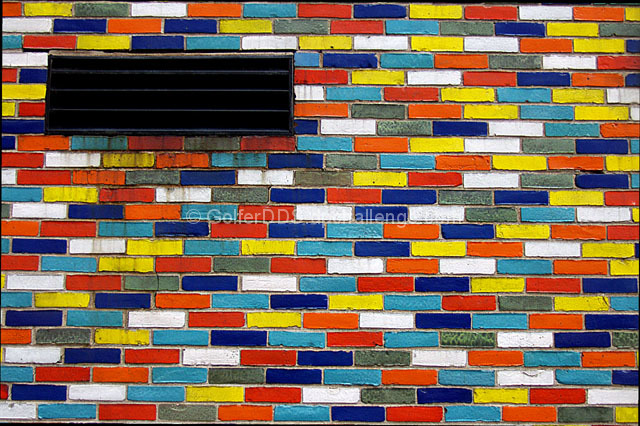
Great color and composition. The vent(or whatever it is) really stands out and pulls your eye to the difference even though the rest of the image is so busy.
This would have been a far more striking abstract without the black grate in the top left corner. I don't really see how that adds to the idea of proportion or lack of it unless you want to argue that the distracting grate adds a lack of proportion to the image. The problem there is, it does so in an unpleasing way and uninteresting way. I think focusing more tightly on fewer bricks and shooting straight ahead instead of slightly up would have made a more powerful statement about the proportion in the design of these colorful bricks. The slight tilt upward is skewing the design.
Composition: Subject Placement, Cropping, Background 5
Technical: Focus, Exposure, Lighting, Processing 8
Appeal: Is it Interesting, Motivating, Etc.? 3
How well does it meet the challenge: 4
Total Averaged Rating 5 Autool







 Add photograph to your favorites
 Add photographer to your favorites


 Photographer found comment helpful.


