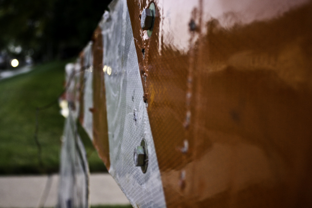
This is quite abstract, which does not really add to the challenge. Shallow DOF works to keep it abstract, though doesn't really help the image sell the "safety" theme. The crop isn't great either... the area on the left doesn't do anything for this... then there's the glare and reflection which is really just too distracting for my liking.
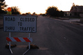
A neat idea that is well executed. That single headlight is a bit distracting, and it's too bad that the red in the sign couldn't have been brought out more so it really said 'caution'! Nice though.





 Add photograph to your favorites
 Add photographer to your favorites


 Photographer found comment helpful.


