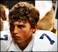
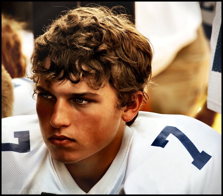
Bethel midget just before an intense game. They were playing one tougher teams (historically) in their league, and were getting ready to go on the field.
They won 26 - 8. This young man is a quarterack and running back, and contributed at least one touchdown and several yards.
Post processing --
cropped
brightened/lightened the eyes a touch
cloned out a couple of blemishes
clarify a couple of times (gives the effect of d/b)
noise reduction
did something with another layer (soft light/hard light/multiply or soemthing).
brightened the eyes a bit
resized
submitted
POST CHALLENGE
Several have asked me how I got this effect. Since "I don't remember" isn't especially helpful, I tried to recreate it.
Here is the original, only resized (shot in jpeg.)
The first thing I did was crop it. I would have liked to have less space on the right and more on the left, but someone stepped between us just as I snapped, and I got their arm there.
Duplicated a layer, did a "screen" pass on it.
Created another layer and lightened the eyes and whites of the eyes.
Removed two small blemishes on the forehead.
At this point, I did another layer, and a combination of multiply and hard light is getting similar results to this.
Ran through a noise reduction program (imagenomic)on default settings and played with the white balance to warm it up some.
Then just a touch more clarify. Resize, and noise reduction again.
It is not exact, but it is pretty close.
Oddly enough, except for the layers with modes other than normal (screen, etc.) this is basic-legal. It is probably even possible in basic, but I haven't tried, yet.
Statistics
Place: 9 out of 126 Avg (all users): 6.2000 Avg (commenters): 7.8889 Avg (participants): 5.9815 Avg (non-participants): 6.3553 Views since voting: 2470 Views during voting: 258 Votes: 130 Comments: 23 Favorites: 2 (view)
Wonderful processing. Looks somewhere between a photo and a painting at first glance. There's a story here to be told that as a viewer I want to know more about.
Looking Deeper
Compositionally the subject and surrounding items fit together nicely. There are some triangular shapes that make this image comfortable, even if the viewer doesn't realize it. His face and head are roughly a triangular shape, the area in the upper right, and the upper left. Why do I mention this? Diagonals and basic triangle components in a comp are naturally pleasing to the eye, yet add a dynamic that will keep any photo from being static and uninteresting. At least that's what I read somewhere once. :-D Actually seems to work.
Even though the processing is substantial, you've kept a high level of detail. I really like the light highlights in his hair. Good tones (color temp) throughout. Possible minor nit is his proximity to the left edge of the frame and that he's looking out - some may frown on that in that he's taking the viewer out of the frame. Personally, I think it adds a touch of mystery to it...what's he looking at, etc...
The difference between the original and the post version is pretty substantial. The end result is very, very good. Congrats on a job well done!
This is awesome. Very powerful, very intense, and I really like the processing. But as a member of the SC, don't you think you should remember better than "did something with another layer"? :-) (That cracked me up.) Great shot and congrats on the top ten!!
What a great portrait. Could be a film poster or, for some reason, the saturation/skin tone reminds me of a stamp. If I was being picky, I'd like to see more team-mates in the background - not sure what it is behind his left shoulder. 8






 Add photograph to your favorites
 Add photographer to your favorites


 Photographer found comment helpful.