28th well done, I was thinking it might have done better though. I like your crop better :) Funnely enough I see you listend about the sky ;) Pitty you can not resubmit for Threes
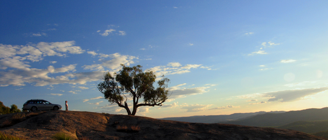
Pretty sky. The car/person element and the tree compete with each other--partly because the tree stands in the way of the person's gaze. Differently composed this might have worked for me.
This looks a bit too much like a car ad. Lose the car and the tiny human and this would be improved greatly. The lone tree in the vast landscape makes the point without the jarring sight of an automobile. It needs more detail in the forergound with the tree perhaps in sillouhette since it is nearly there anyway.
Good illustration of the theme, but the picture itself is somewhat lacking. I don't care for the car even though you may have intended it to be a third element to the different proportions, but the tree and the person would have been enough. I like the panoramic but there's something about the colors that just doesn't "wow" me. All in all, it's a pretty nice shot, just not terribly interesting outside the challenge.
I'm not sure the person or car were needed. If the tree were more to the left of the frame it could have conveyed proportion on its own. Beautiful scenery!






 Add photograph to your favorites
 Add photographer to your favorites


 Photographer found comment helpful.


