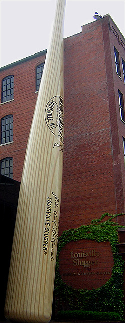
Great on the challenge. Only 2 things i'd change and they are minor. Lighten up just a little so we can see the sign on the building. Add a person at the base just for that extra blast of proportion. It's still a 10.
I love the subject - the idea of a bat as tall as a building fits the challenge topic perfectly. I wish I could see the top of the bat - the composition leads my eye there and then I'm off in nothingness without the little endcap to allow my eye to come back down to the bottom of the frame again (and I think the edge of the building would do that). Nice colors. I'd like to be able to read the sign on the wall of the building a little better.
Nice idea. The slim Jim format works well for your subject. Exposure great below the sky. The sky is unfortunate - imagine how the scene would loo with a nice blue sky contrasting with the orange bricks.
Excellent depiction of proportion. I have to only give it a 5 though, because the sky is so washed-out. It's a tricky shot with such a variation in darks and lights.





 Add photograph to your favorites
 Add photographer to your favorites


 Photographer found comment helpful.


