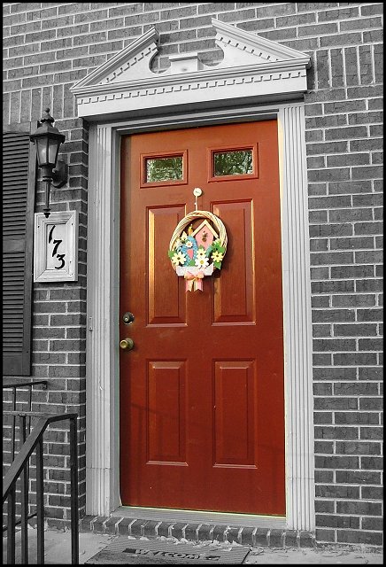
This is my front door. The door and decoration are as shot, everything else is rendered in B&W. The 173 was selected and brightened and contrast was increased to make it stand out better. Cropped and borders placed around it and that was it.
Statistics
Place: 83 out of 176 Avg (all users): 5.5399 Avg (commenters): 5.3000 Avg (participants): 5.3261 Avg (non-participants): 5.8169 Views since voting: 1034 Votes: 163 Comments: 11 Favorites: 0
The selective de-saturation adds impact to the fake look of the brick-work, especially with the faux-georgian/palladian pediment on the doorway. The cheesy garland just re-inforces that impact. The overly-perfect bpointing, allied to the overly clean lines and maintenance of the scene speak of an obsession with appearance to the exclusion of historical accuracy, or perhaps a simple ignorance of it. Affecting shot, in those senses; lacking in a sense of contrast - nothing to re0inforce that message, or to make your real message clear if my assessment is wrong.






 Add photograph to your favorites
 Add photographer to your favorites


 Photographer found comment helpful.


