You've got some rather constructive comments for this shot.
I must say, there are some merits with the shot, but on the whole it would need a little more.
What is good with the shot:
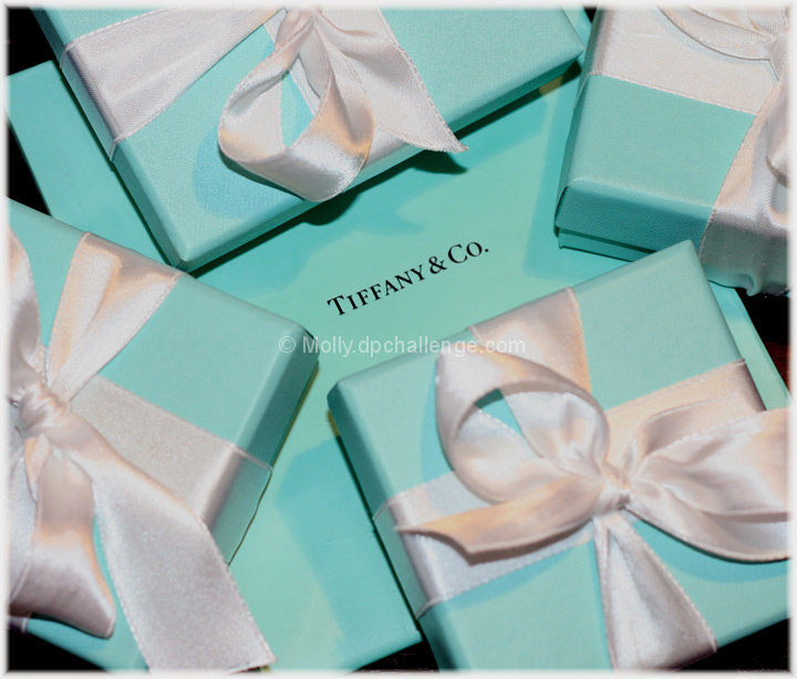
- Fundamentally, the brand appears sharp.
- We probably be able to use it in a magazine as a background on a full bleed page.
What should be improved:
- Very glaringly - the lighting and shadows. Try to eliminate them as much as possible. (unless it's suppose to add depth in a photo, else it'll be deemed as distracting.)
- Background - try to go for a white background. That is more inline with the Tiffany branding.
- The focus - Try to get most of the photo as sharp as possible
Others:
- I feel that with a product, it could work better, but than it'll be a totally different setting
- The arrangements of the boxes - it could be neater - but than again, if you've eliminated the shadows, it could feel different. (thus would be ok)
I think it'll be good to have just the card you used as base, and a simple ribbon. Just plan and simple. See if you can get that shot. :)
In the first glance of the thumbnails I thought this was going to be different. Arrangement of boxes to accentuate the words are nice, but the shadows and lighting aren't so great. If you only have 1 flash (as I do) you have to find creative ways to bounce light to eliminate distracting shadows. I have also found that using Model CE-300PDQ lights from Home Depot, with daylight 6500K bulbs work well for a constant light source.






 Add photograph to your favorites
 Add photographer to your favorites

 Photographer found comment helpful.


