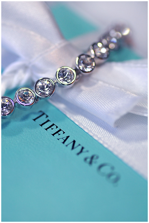
The Image: A bit of a rush job really. We were off to Adelaide and so I had about 45 minutes to set up, light and shoot this image. It really didn't turn out the way I really wanted it to. I knew some people would recognise it as mine.
As mentioned by the voters, it would have been better if the logo was in focus, I agree.
The Edit: Not much other than levels and some d and b and blur...USM.
The Prediction: Well, now that we are in voting, it's a bit late, but this surpassed my expectations. I expected a 6.0000
Statistics
Place: 16 out of 118 Avg (all users): 6.3529 Avg (commenters): 6.8824 Avg (participants): 5.9070 Avg (non-participants): 6.5273 Views since voting: 1818 Views during voting: 308 Votes: 153 Comments: 22 Favorites: 1 (view)
damn, all the elements are there, but half the tennis bracelet is oof as is half of Tiffany's! I'd like to see at least one of those two in full focus.7
I like the way you composed this. However, something about the jewelry doesn't quite appeal as much as it's meant to. Maybe it needs to be polished so it sparkles? Or maybe all of Tiffany & Co. needs to be in focus -- a company would not put half its name out of focus for a catalogue.





 Add photograph to your favorites
 Add photographer to your favorites

 Photographer found comment helpful.


