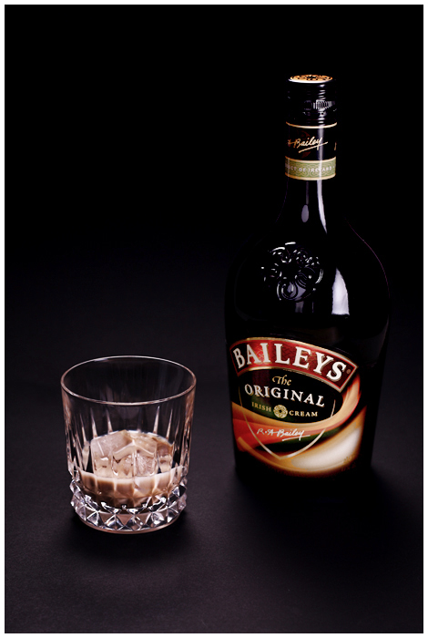
This is a nice shot. I like the composition, framing, background and lighting.
What could have been improved would be the focus on the words. It's suppose to "showcase" the brand and thus, that should be in absolute sharp focus.
The other this I would change would be the glass content. I don't have an idea how this should be done. Probably would need to try out a couple of setup. There was a suggestion of hot coffee! The current shot makes the drink rather "flat". It doesn't bring out the "yummy" factor.
I would either lose the glass or empty the content and knock the glass over (to show that it's been drank!)
Overall, the shot is excellent and I felt that it should had rated higher.
Nice setup, but I would have preferred if there was a bit more separation between the bottle of Baileys and the background - maybe tweaked the background lighting a bit?
Nice idea, maybe a diff comp would have helped, maybe the bottle in background and the glass in front, shot from the same level would have added depth, and you'd be able to see the bailey's off into the background, nice one anyway, 5.
i think if you were on a more level angle with the bottle i would like this better. i tend not to like a downward angle in photos like these. good lighting, subject positioning is good





 Add photograph to your favorites
 Add photographer to your favorites

 Photographer found comment helpful.


