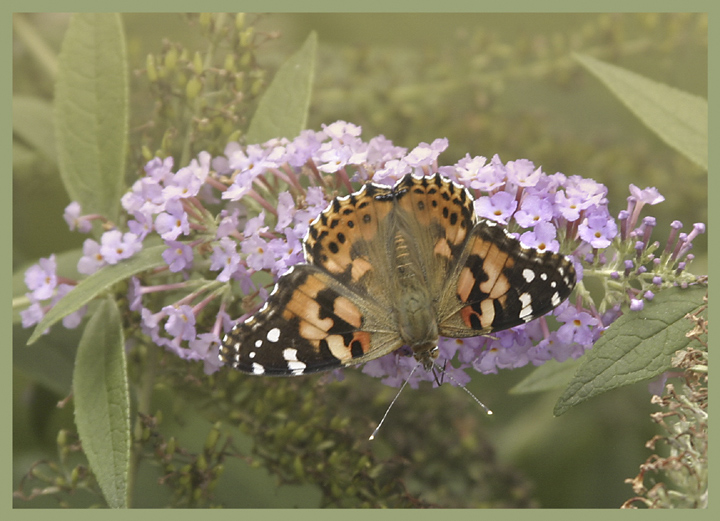
That is a beautiful shot and the pastel tones are very pretty. It should have ranked much, much higher than it did. And if you rotated it as one has suggested, the shadows would fall wrongly. It is fine as it is.
this has a nice graphic feel to it, like wallpaper (the real kind, not the virtual stuff!). I might have rotated it 180 degrees to have the butterfly facing up.
Hmmm... I'm assuming you meant for this to be washed out, but I'm not sure how much I like the effect (just personal preference, though!). Great composition and I love how sharp the butterfly looks. :)




 Add photograph to your favorites
 Add photographer to your favorites

 Photographer found comment helpful.


