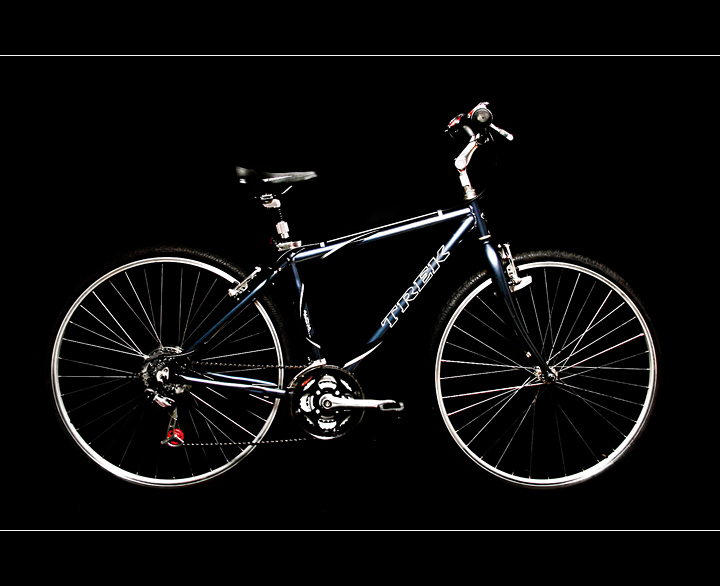
Much more boring than I had hoped and I'm not pleased with the pixelated effect on the spokes & other small lines. As far as I know there is nothing I can do about that. I went back & forth on whether to enter this and then I realized....it doesn't matter if it tanks. I like my bike & I don't care as much about scores as I used to. These days my thrills come when a customer signs a check for a print order! : )
I still would love a 6.0 but I don't see that happening with this image.
Shot in RAW. RAW conversions. Photshop - levels, healing brush, dodge/burn, cloning, curves, USM, crop, save for web.
Statistics
Place: 50 out of 118 Avg (all users): 5.8910 Avg (commenters): 6.2727 Avg (participants): 5.7111 Avg (non-participants): 5.9640 Views since voting: 2472 Views during voting: 301 Votes: 156 Comments: 15 Favorites: 0
I think I would have liked to have seen this on either a white background or some lighting from behind to separate the bike from the black color. It does look sharp and clean tho and I never noticed the pixelation lol.
At first glance its an outstanding shot but after looking at it a bit its hard to distinguish the individual components. As a cyclist myself I tend to look deep at the gears, brakes, and other parts of a bike when viewing ads. I really like the border lines you added to the shot.
Fit Challenge Criteria: 2/2
Contrast/Color: 1/2
Composition: 2/2
Photo Quality: 2/2
My Subjective Affinity: 2/2
Excellent idea. The lighting is a bit harsh, leaving a bit to be desired, especially with the tires and seat. Aside from the lighting problem, everything else looks great.





 Add photograph to your favorites
 Add photographer to your favorites

 Photographer found comment helpful.


