Fit Challenge Criteria: 2/2
Contrast/Color: 2/2
Composition: 2/2
Photo Quality: 1/2
My Subjective Affinity: 2/2
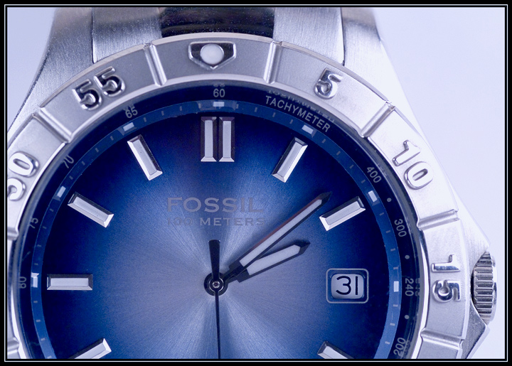
What a great idea. The lighting is almost perfect. There are just a few hot spots that could have been removed. Also, I think a darker background would have looked better for this photo. Maybe a dark blue like the watch face.
Brilliant sharpness and colour, the face looks so sleek. This shot is quite simply a joy on my eyes. Never thought I'd say that about photo of a watch, so well done.
the lighting on the sides seems a bit harsh, but I know how difficul it is with reflective objects and limited to basic processing I think you did good!
not a bad watch shot. The hands at 10:10 are used in watch and clock photography to set off the brand. That would have helped here and I would have also used some of the advanced editig techniques to bring out the Fossil name a bit more.






 Add photograph to your favorites
 Add photographer to your favorites


