Author Thread
Post actions
Comments Made During the Challenge
Post actions
The idea is good.
Post actions
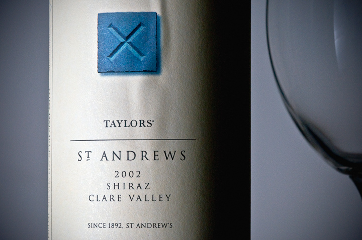
Nice lighting, like the glass to paint the picture of the product. Ripple in label is no good though! Because the eye is drawn to the blue it the ripple is there and I am thinking to myself, "What is that."
Post actions
Wine? I'd rather not - it's so annoying. Perfect photo: 10
Post actions
nice photo, great for this challenge
Post actions
The composition seems unbalanced to me. Also I find the lighting a bit unflattering.
Post actions
Well executed, though I'd liked to see more of the product
Post actions
Nice neutral colours, makes the blue stand out nicely but not too much.
Post actions
Maybe with some wine in the glass?
Post actions
I would like to see a bit more of the glass and bottle on this





 Add photograph to your favorites
 Add photographer to your favorites