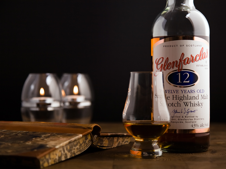
Great concept the the color scheme fits well with the product. The book is a great addition. The reflections in the glass and bottle take away from the picture though and I think your scores will not be as high because of it.
Nice arrangement and creation of atmosphere. Selective focus is right on. Light from the left is a little harsh - see winner of double take II for a sample of how I would have liked to see the light here. Still one of my favorites.
Adding that worn book really gives this an old, classic, warm feel, especially with the colour scheme. This is how whisky should be advertised. Only thing I'd have done differently would've been to move the glass a tad so it's not covering the label writing.
i dont like the way the glass is covering up the label on the bottle. i also dont like that the neck is cropped off. the candles in the background weren't necessary, the photo was just fine without them





 Add photograph to your favorites
 Add photographer to your favorites


 Photographer found comment helpful.


