Author Thread Comments Made During the Challenge
Post actions
Post actions
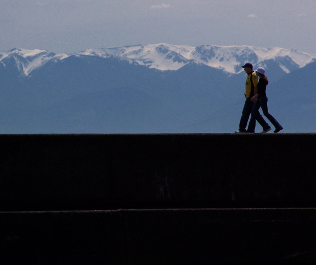
I like much: The expression of proportion. - the simplicity of the picture.
Post actions
I think this would look better with most of the black at the bottom cropped off. That would give you a more dynamic horizontal composition.
Post actions
Nice, maybe trim a little more from the bottom.
Post actions
Great DOF. Personally I would have cropped it vertically a bit. i.e. lost a bit of black.
Post actions
There is a lot of dead space at the bottom, a tighter crop would help.
Post actions
Pretty photo. I'd like to see what it looked like cropped just below their feet.
Post actions
nice shot, but i think would be much better if you cropped out a lot of the bottom.
Post actions
Lovely. I like everything about this one. Well done.
Post actions
A very good photo almost a great photo if only the lighting was better. An 8 from me good luck







 Add photograph to your favorites
 Add photographer to your favorites


 Photographer found comment helpful.


