Fit Challenge Criteria: 2/2
Contrast/Color: 2/2
Composition: 1/2
Photo Quality: 2/2
My Subjective Affinity: 2/2
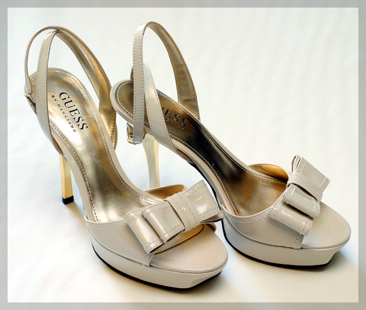
Everything looks really good here. There are only two things that I noticed that could possible be changed. First, there appear to be wrinkles in the white background in the upper-right corner. And second, the logo on the left shoe is partially hidden. There are also a few hot spots on the shoes that could be removed.
This is a nice shot, but I don't think that it evokes the sexiness of what GUESS usually stands for. If I needed a product shot for my GUESS line, I would want it to evoke how people are going to feel when they wear my product. This, to me, says that GUESS is simple product for a simply woman.
I think a symmetrical view of these from the front-on would've looked really good, though this works well enough. Nice background and an extra kudo for not using a pair of old/scuffed/battered shoes!






 Add photograph to your favorites
 Add photographer to your favorites

 Photographer found comment helpful.


