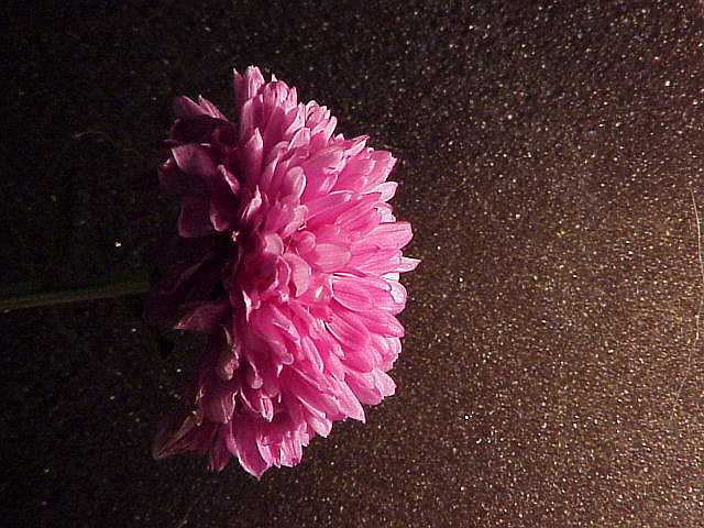
I would have liked portrait format more. But that's just personal taste, nothing I can backup with technical arguments. The photo seems a bit grainy which in this case does not work good. It weakens the colour. The lighting however has something dramatic, which I like. -stephan
Very good photo, good color and focus. I like your choice of backgrounds, very nice. Single light source obvious enough. Interest is a tad low and I have no ideas how to add more punch, then again, I'm getting an average of 4, so who am I to judge/suggest that. I'm willing to upgrade your score, from 7 to 8. Swash
I really like the background you used. I'm can't tell what it is but the rough texture against the delicate flower is a very nice contrast. I like the pink and brown also. Good job.
am enjoying texture on the background.... and the gradation of the light on it. It certianly provides interesting contrast to the softer bloom. The flower placement is problematic...... I could see tight cropping on the top and bottom as a solution to my preferences. I love the half moon shape of the flower. 5
Like the texture to the surface infront of the flower. Flower looks 3 dimensional. Good lighting effect and sharp picture. I'm not a 10 giver so it hurts but I must give you one for this.





 Add photograph to your favorites
 Add photographer to your favorites


