One advantage this shot has is that I knew right away which challenge it was shot for, so in that area it definitely met the challenge.
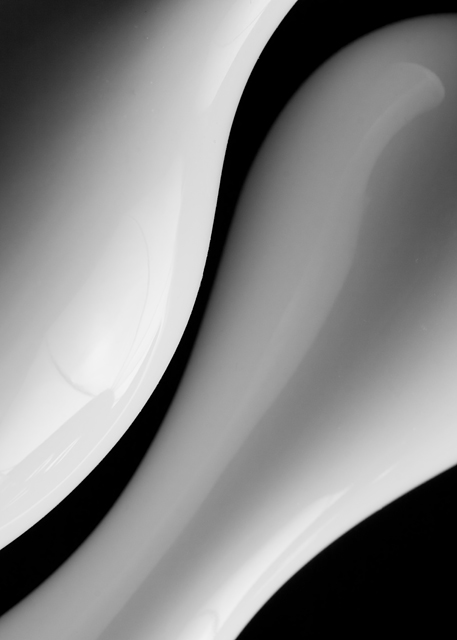
Two things I noticed right away - first, the upper right corner. The white does not quite reach the top to move out of the frame. It's the only area where the white is that close to the edge and does not flow out of the frame, so it unbalances the shot for me some.
Second - in the left object there is a darker reflection of something going across the object. I realize this is basic editing, but if possible I would have removed that reflection or prevented it if possible. It's direction goes against the flow of the shot. The other, lighter reflections don't bother me much as they flow with the shape of your objects and actually add some interest IMO.
Speaking of which...the flow and curves of the shot are its definite strength. It has a very nice smooth feel to it. I would have liked a bit more dynamic range in the b/w conversion. It does look a little flat.
Overall, I would have scored this a 6 or a little higher if I could. (I haven't looked at your score yet, or the other comments) The concept works great for this challenge and on its own - yet the execution of it has a little room for improvement imo.
A very elegant take. Very nice b/w work here. Unsure though if I would've liked the shot more if the right vase had lines as sharp as the left one.
(no vote)
Whether vases or elongated light bulbs, the pattern of curves agains a dark background works well. The reflection in the white object on the left has soft dark lines suggestive of umbrella staves. The circular light source goes well with curves, the staves could be taken for window dividing elements, so the distraction isn't excessive.





 Add photograph to your favorites
 Add photographer to your favorites

 Photographer found comment helpful.


