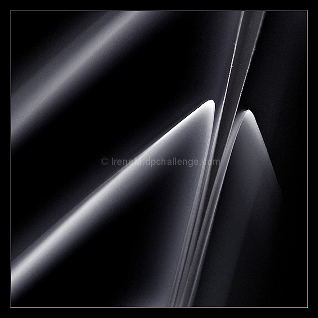
How abstract is abstract? Really looking forward to seeing the other entries. I love abstract images, paintings, etc. Just not sure if I managed to really capture an abstract look. And I hate the tiny speck on the edge of the paper at the upper right...
Post challenge:
Thanks for the great comments (especially Alfredo nutzito who gave me a telling off for trying to copy me and not doing much of a job of it ;-D
As for the asymmetric frame, Oliver eyewave mentioned it too. It’s not meant to be asymmetric and the image frame was most definitely not asymmetric before I uploaded it. Strange.
In case anyone was wondering what this is, it’s folded paper which is a pain to work with in basic editing.
I thought of the title "Nuances" as soon as I saw the finished image. Just to be on the safe side I looked it up:
1. A subtle or slight degree of difference, as in meaning, feeling, or tone; a gradation.
2. Expression or appreciation of subtle shades of meaning, feeling, or tone.
Statistics
Place: 7 out of 318 Avg (all users): 6.6082 Avg (commenters): 8.0000 Avg (participants): 6.7308 Avg (non-participants): 6.5054 Views since voting: 3835 Views during voting: 320 Votes: 171 Comments: 24 Favorites: 1 (view)
Congratulations :)
It was such a mix of photos and such an up and down seesaw during voting that I had no idea what photo will finish where. I had a hunch that this would do well.
Very original shot Irene. Love the treatment you gave it. IMO, I think some voters may have felt that this image was a little low key in treatment impacting your score a little.
Irene, you are slipping, you are not on the front page today... D700??? :)
I absolutely LOVE this...I love your title too. Amazing work as usual, you never disappoint. I didn't get to vote on this challenge, so didn't comment on this
Amongst the many Irene imitations, this is one of the least accomplished...a bit too much noise in the background, several imperfections in the paper border, asymmetric white(?) line to the frame, etc, etc. The picture deserves a 5 from me, minus 1 point for trying to copy Irene = 4
Congrats for the result Irene. I still think this is not at the level of your usual work though. Never mind, just keep on "copying" yourself ;-D
Wow. I wish I had seen this during editing. One of my favs in this challenge for sure. I guess you aren't just water splashes are you? (You know I am not serious right?!)
I don't think you need another person to call out who they might think it is who shot this. Really like the glow but not as much of the slight hint of noise. (no vote)
Amongst the many Irene imitations, this is one of the least accomplished...a bit too much noise in the background, several imperfections in the paper border, asymmetric white(?) line to the frame, etc, etc. The picture deserves a 5 from me, minus 1 point for trying to copy Irene = 4
Extremely powerful abstraction. What is it, though?
And this question adds to the strength to the image. Perhaps I wouldnt evenr want to know what it is as it might spoil the mystery. Perhaps moving the pattern a tad more off the center would create a more powerful visual.
Nice shapes and light. The edges seem soft and the background shows some grain or texture. Part of me likes it this way, and part of me would like to see it with more dramatic transitions.





 Add photograph to your favorites
 Add photographer to your favorites


 Photographer found comment helpful.


