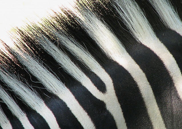
Nice but less abstract feeling than ideal. The current version is a good detail study of a zebra. The abstract pattern aspect might feel stronger if the original would allow for rotation and then eliminating most of the backlit fringe area, although at the expense of making it less pretty to some eyes.
I gave you a really low score for this photo, sorry. This is because the image was shot in colour rather that black and white, so doesn't meet the challenge for me. Good composition though.
This works swell. My only nitpick is the yellow fringe on the edges of its hairs. It would've be quite alright to use desaturation in PP for this challenge.






 Add photograph to your favorites
 Add photographer to your favorites


 Photographer found comment helpful.


