Color Saturation and Hue: N/A image is monochrome.
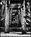
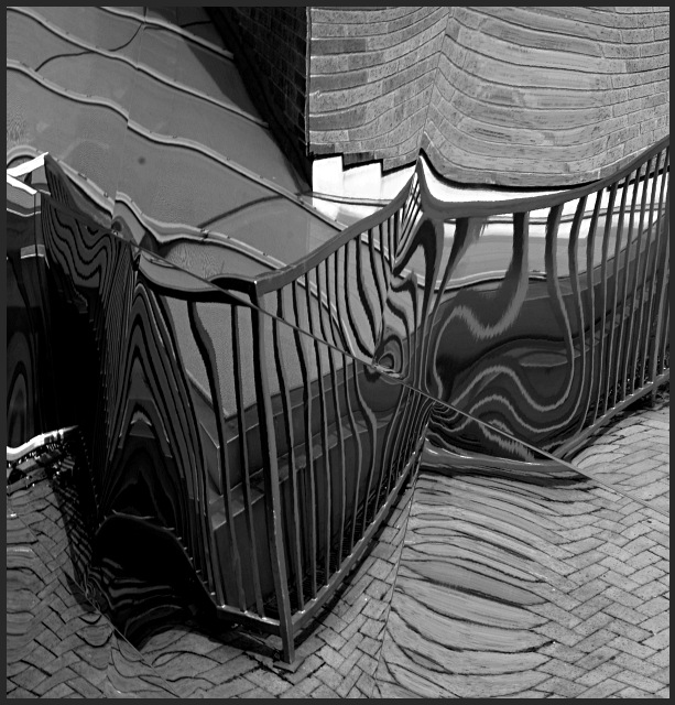
Brightness and contrast: The white highlights are very bright and compete for attention. But the blacks aren't quite all the way black. I would have liked to have seen a real inky velvety black in the darkest areas, and perhaps a few more of them. They would help this image really pop.
Focus and depth of field: Both are very well executed.
A little more black and deeper blacks, as mentioned above, would make this image stand out. As it is, there is a lot of gray here. Which, is not bad. But gray doesn't grab the attention as well.
Other than this relatively minor point, a very well executed image, and a well deserved finish in the top 30.
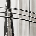
I can kind of see it is a reflection image...one that draws definite attention. The composition could have had a little more dramatic angle I feel. The white is almost balanced in the image which sort of take attention away from the center. I would still rate it pretty high because it does justice with the theme.. albeit it will be controversially abstract for some. Good job, could be better.





 Add photograph to your favorites
 Add photographer to your favorites

 Photographer found comment helpful.


