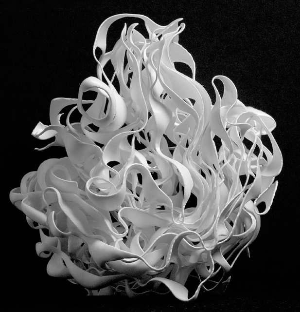
It's abstract alright. Great job with the lighting. Few nitpicks, There's a cut off near the bottom left side of the sclupture. I can also see some image noise in the top right corner. Boosting the contrast for a pitch black background would've blown the hightlights. I suggest using the Selective Color dialog and darkening the black through there. It'll leave the hightlights alone.
(no vote)
Visually this piece is very interesting. But to me it seems like a straight photo of an interesting sort of sculpture. I think this would have been better with perhaps a close up on one section or even with some dramatic lighting. At that point I think it could be a great photograph instead of a photo of a cool thing.







 Add photograph to your favorites
 Add photographer to your favorites


 Photographer found comment helpful.


