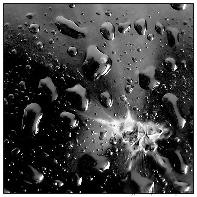
This is a tomato with some water sprayed on it. The white thing is the scar where the tomato was attached to the plant.
I tried many variations in editing, but ended up with just some noise reduction, contrast enhancement, and sharpening.
It turns out the "noise" in some of the dark areas is actually the mottled skin pattern. The tomatoes we've grown turn out not to be pure, smooth red at this kind of magnification.
Lit by a window with the shade drawn.
With this entry, I survived week 5 of the Better than Average side tourney, where we have to beat our own overall average score. My target this week was 5.6990.
Statistics
Place: 48 out of 318 Avg (all users): 5.7963 Avg (commenters): 7.6000 Avg (participants): 5.8611 Avg (non-participants): 5.7444 Views since voting: 1138 Views during voting: 254 Votes: 162 Comments: 12 Favorites: 0
Brightness and Contrast: The darkest areas are nice and inky black. Very nicely done. The brightest areas lose detail, and that would bring it down a bit for me.
Focus and depth of field: Focus is excellent. Depth of field is very good. I have some qualms around the "scar" area. I can't quite tell if the apparent softness is due to processing, depth of field, or just an optical illusion. I'll go with the latter, since I seem to be the only one who sees it.
I'm a little put off by the white area. Compared to the rest of the image it looks almost like a fungus. There are angular bits, but then the whole thing seems a bit soft. The angles are, to me, a bit of a jarring contrast to the drops; to the point where they compete with each other.
I really like the texture of the drops and the surface of the tomato. If the white part were more muted, or not even there, I might even like it a bit better.
As is, a nice creative take on the challenge, and I think it should have finished a bit higher in the voting.
My hatred for water-drops takes a back seat to the gorgeous use of the splatter. However, without the water-drops, I'd have been inclined to bump you up 2 or more points.
Strong entry - excellent use of high contrast - the discordant shapes, the spray of light in the lower right, the deep rich blacks - it all creates a wonderful abstract - 7
Really nicely done! You've done well in creating an abstract WITH something to draw the eye to. The very sharp focus you managed really helps create a clean look to your image.






 Add photograph to your favorites
 Add photographer to your favorites

 Photographer found comment helpful.