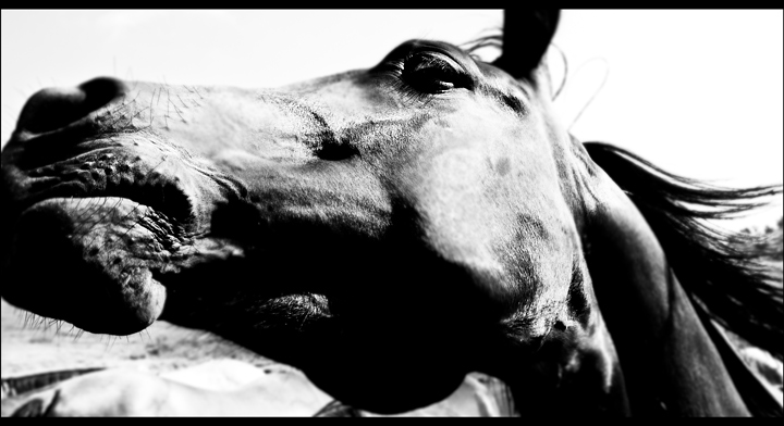
Corney title, I know. I wanted to take something that showed the power and motion of horses - this was the closest I got. Processed a bit more that usual with cropping, conversion to B&W, cloned a bit of detritus, added a blur layer to add emphasis to particular areas and then some burning and dodging. I know this will not do well but I like it.
Statistics
Place: 54 out of 121 Avg (all users): 5.7011 Avg (commenters): 7.2778 Avg (participants): 5.4615 Avg (non-participants): 5.8319 Views since voting: 1185 Views during voting: 361 Votes: 184 Comments: 23 Favorites: 4 (view)
Beautiful image. As I see from your photog comments, you knew going in that this was probably not super DPC-friendly. I'm always very pleased when someone enters a shot that he/she likes knowing it may not be the bee's knees (to the masses). Enter what you love, I say. If it turns out to be popular, so be it. If not, at least there will be some that share your vision (as evidenced by the commenters average!).
Personally, I really like various aspects of this shot. The B/W looks great (I'm a sucker for high contrast), I love the tight crop, and the selective blur/sharp works like a charm. Really the only thing I don't like is the border. It's close, but not quite right. I would have made the top and bottom black bits larger (so as to emulate a wide screen movie look a bit more).
All in all, a fantastic job. Keep on keeping on. Now I'm off to browse your portfolio a bit more!
Please feel free to shoot me a PM if you have any questions or comments.
Nathan
I for one am very pleased you entered this. One of the most powerful entries in the challenge - you definitely captured the spirit and power of a horse. Your choices in crop and processing really add to this. One of my 10s.
Strange, strained look for the horse. I love the tones and I wish that dpc would allow more width for this to have better impact. Lovely black and white tones on this. Very unique! I like the style of this.
Usually, a shot that has this many technical flaws would get a 4 or 5 from me, but there's something about the energy in this photo that throws technicality to the wind. It is like some of those old Life photos where your first thought isn't, "should have used f/5.6", it's "How wonderful!"
I really love the B&W tones here. In some areas the shadows and highlights are a tad harsh but for the feel & mood of this shot it works. It gives it a ol' tyme feel and calls the eyes attention the cock of the head and the windswept hair. In some aspects it takes on the feel & mood of a painting. The pose of the horse's head and the windblown mane really play up a feel for the horse's majesty and projects an image of the horse galloping at full speed. Even though we do not see the rest of the body, we really do breathe the wind with this horse because of that pose and way you captured him/her in this composition. The crop of the photo is nice and tight; keeping the attention focused on your main subject. My critique on the shot is that while tightly focused on your main subject you cropped it a bit too much. You cropped out a bit of the horse's mouth and ear; that I feel is a flaw because to show the full horse's head would further strengthen the beauty and majesty of this lovely animal.
Hope you ducked, cause I wouldn't want to be around a horse with a tense mouth like that! Too tight a crop on muzzle and ears, otherwise a very unusual pov. Wonder how this would've looked in colour.
this is really pretty. kinda tight crop on the nose, but it doesn't seem to be much of a problem. i like your focus, it really fits your photo. black and white was a good idea with this photo-8





 Add photograph to your favorites
 Add photographer to your favorites

 Photographer found comment helpful.


