Anarchos, the equivalent functionality exists in the Gimp. Zeissman, color contacts would create this sharp outline as they would not match the color of the rest of the eye. Greenem2, impressive work!
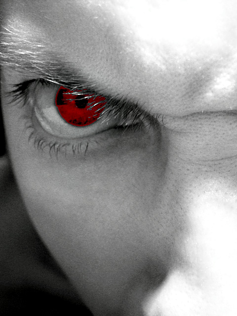
There is nothing wrong with Desat. or adjusting one channel, that is just like adjusting the color, but I do not understand the uneven outline around the eye, or how it looks layers. A step-by-step, how'd they do that would be quite insightful I think.
Isn't desaturation and adjust BLUE channel in violation of spot editing? I mean, you are only changing one aspect of the color spectrum, not the whole image as with RGB curves adjustment (to all colors).... just wondering how the rules are supposed to work :)
First of all, I e-mailed you a description of my steps during the voting, and desaturation was only TWO STEPS out of SIX or SEVEN. I'll post my original tomorrow for all to look at, but for now here are the basic steps (which you DID recieve):
(first of all I was wearing blue contacts) Curves (blue channel, to boost the eye color) Desaturate all colors but blue Change blue hue to red, adjusting saturation & lightness also Desaturate all colors but red, boost red saturation Curve adjustments, unsharp mask, etc. (nothing to do with the eye)
I will not believe that this was legally edited until I have learned how, which I have asked for, but did not recieve. A desaturation would not give this affect.
Excellent! Personally I love photo's of this kind where one colour sticks out. And in this case it's not just a cheap effect but serves the purpose of the photo. Composition, lighting and focus (well chosen DOF) are also very good. I guess many will gripe about the "overexposure". It's not! It adds to the stark expression. I especially like the wrinkles which express the emotion perfectly. This is one of my favourite photos this week. Good job! -stephan
Excellent, nonsingle by the effect of the eye, the illumination, the approach, the expression and ancuadre they make of this photography an art work. 10 jcof
So tell us, what loophole did you find in the rules... I'm giving this a high vote because I like it, but it still seems edited is some way, even though the judges validated it. So what's your secret methods??
Composition: Subject Placement, Cropping, Background9, Technical: Focus, Exposure, Lighting, Processing9, Appeal: Is it Interesting, Motivating, Etc.? 10, Does It meet the challenge?9 Total Averaged Rating9. DPz VERY Nice!
i really dig this photo, but i also really would like to hear how you did it because it is driving me nuts! :) ! please email me! the framing and composition are awesome and the slight grainess works really well. 9--alecia
Cool image. The detail of the skin on the nose and forehead and in the eye almost makes it look like a Roy Lichtenstein image :) And actually, when you think about, very big emotions tend to become cartoonish, almost a caricature :) Good composition and great choice of cropping. I think I know you well :) 8 Journey
Excellent work... Whatever method you used to create this effect is definitely a strong one. The sense of 'wrath' is appealing in this photo :) = 10 - setzler
very angry...very evil....very nice shot....i look forward to seeing how this look was achieved after voting is finished...i hope this shot does well....it is certainly in my top 5 for the week! This is wrath.
Congrats on the Admin note. Great job. I am asuming that this is a red contact or film that has been cut and worn like a contact? I am not usually one for harsh lighting, but in this case, it works very nicely. Wrath is a good chioce for the challenge, in my opinion. You have done an excelent job of portraying it here. Angle and framing are excelent. Lighting is perfect. Great shot. Good luck in the challenge. ~hbunch7187~






 Become Wrath
 Add photograph to your favorites
 Add photographer to your favorites

 Photographer found comment helpful.


