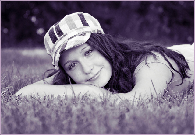
I think this might turn out to be a really good portrait if it wasn't for the color. Now I know that you did it for the challenge but some things to learn here on DPC is things like this usually don't do that good. I would have said use a similar image in true color in the FS and see how it does... I'm sure it would have done much better than this one. The purple just makes it look like bad processing. But don't let it get you down. If you like it then that's all that matters really.
This is a great shot. The model has a great expression and it is well composed. I think he purple part is a bit of a stretch - almost too subtle - but I'll take it.
very pretty, great expression and nice, casual hair. The hat adds, too. To improve I would have chosen something in the photo to be purple, and then desat if it needed it, instead of turning the whole image purple. Taken at at a powerful angle and good focus : )





 Add photograph to your favorites
 Add photographer to your favorites

 Photographer found comment helpful.


