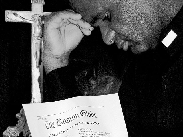
"Inspired" by the Crisis in the Catholic Church. Those who teach about sin, have sinned. They have fallen from Grace. It is not a commentary on my faith or anyone elses.. Faith is about your spirit, not about what humans do to make a mockery out of things.
Statistics
Place: 22 out of 150 Avg (all users): 6.0222 Avg (commenters): 7.4231 Avg (participants): 5.9352 Avg (non-participants): 6.0676 Views since voting: 1813 Votes: 315 Comments: 29 Favorites: 0
Karen, sorry I didn't get around to commenting on this photo. It is great! I gave you an 8 strictly on the right hand. For some reason, it just doesn't look good on my monitor, kinda like it was somebody else's hand. This is a great photo and a better statement. You should be very proud. Rob
Everything about the composition of this works for me except the placement of the paper. It doesn't seem placed in such a way that he can be reading it. I thought at first that maybe it was the front page of an open newspaper, but that doesn't appear to be the case. The emotion of what you've depicted is well-represented in his expression and body-language. The thing that most damages my ability to appreciate the photo is the pixellation. There is the school of thought that at times pixellation adds something to the nitty-gritty nature of a photo, but it's a school of thought I have a hard time relating to. Just passing this on so you'll know there are people who probably feel it's beneficial and those who feel it's detrimental. THat said, if it wasn't intentional, you may have been able to avoid SOME pixellation by not compressing so much. Your image can be up to 150K. Take what you can use, disregard the rest, 6, just-married
this is great. i love the lighting, the composition and the graininess. i really cant decide tho if i would like this even more with out the paper, even though that is really an irrelevant statement! nice job here! 9--alecia
I really like the composition of this photo. I also like the image and emotion it emits. However, I don't really like the graininess of it. I feel that B&W is appropriate for the mood, but more clarity would be better. Otherwise, I really like it and, you know, when I look at the thumbnail, it's much better.
Powerful image. Good choice of B&W. The pose of the priest is convincing and adds to the theme. What I find terribly, terribly distracting and marring the image is that Boston Globe piece of paper. It is so terribly contrived and it just sits there to tell the viewer the story: but the story is told very well without it by the image and underscored by the title. 7 Journey
Concept was good, but there's something in the execution that bothers me. It seems overly 'adjusted' in contrast or sharpness or something... Not sure what exactly. ~MyQyl~
Excelent. Great focus and clarity. You have the perfect focus on the paper so we can see the message there. The way he is positioned, really creates the mood. I have given this a 9, but as I think about it, I'm now trying to figure out which of the 7 sins this represents. The abuse could represent wrath...ok, I get it. Lust. This is in relation to the sex abuse scandals from clergy. nevermind me, just thinking out loud. lol. Your angle and framing/cropping are excelent. Lighting is wonderful, and I really like the use of black and white here. I'm a little slow, but I got it. LOL Good luck in the challenge. ~Hbunch7187~
Lust, right? :) Love the use of black and white...brings out the 3 important objects in the frame..the color, the cross, and the scandal...which happen to comprise a lovely triangle. 2 nitpicks...position of paper makes this look somewhat setup...and the palm of his hand being lighter and smooth in the middle of darkness/texture is a little distracting. 8 Lisa
I understand putting the Boston Globe article in the shot for context, but it seems kind of shoved in and a bit distracting. The man seems to be reading the article rather than meditating on/repenting for his sins as the cross and posture indicate.
Nice job!! I think you executed this well. It works in B&W - gives it more severity. The placement of the piece of paper seems a little strange...like he's holding it up just for the camera. Could have worked without it probably just as well. Overall, it's a great pic and fits the challenge well. ~indi






 Add photograph to your favorites
 Add photographer to your favorites

 Photographer found comment helpful.


