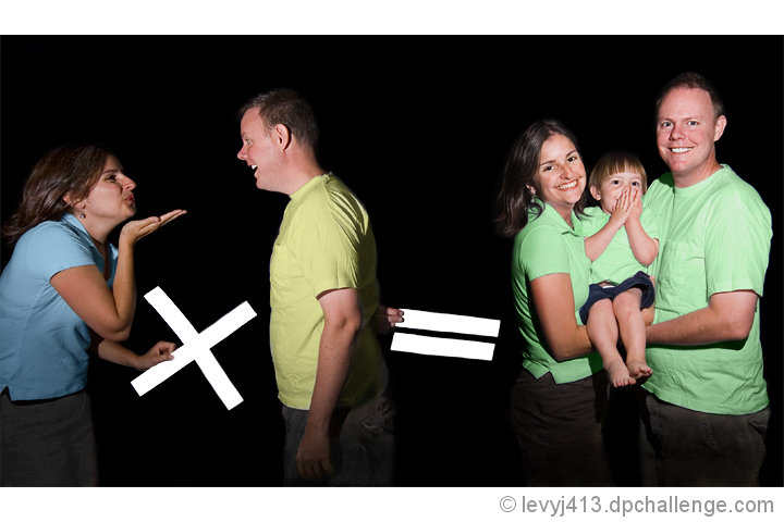
These are my very good friends Jon and Stephanie and their 2-year-old son. I love the challenge interpretation and I'm pretty happy with the results.
I first thought of using addition, so made a plus sign. Then "go forth and multiply" occurred to me, so now it's multiplication. Someone will probably comment that blue plus yellow, not times yellow, equals green. Steph's actually wearing a light blue shirt and Jon and their son are in white. I changed the colors in editing.
I used the old "two flashes in one shutter opening" trick:
1) Work in a dark basement (not pitch black, but very dark), with a black cloth hanging from the ceiling
2) Open the shutter in bulb mode
3) Using my point-and-shoot as my off-camera flash, light the family on the right and then replace the lens cap (shutter's still open)
4) Pick up their son while they move over to the left and pick up the mult. and equals signs, then flash again from in front of them
5) Close the shutter.
I know the lighting's harsh. I tried bouncing it off the ceiling several times, but since I chose F/8 to avoid any DOF problems, those just came out too dark. So I used the flash pretty much straight on.
Turned out the last pose was the best for their expressions, even though he's got his hands in front of his face. I'm hoping the concept will carry me over the imperfect lighting.
Here's the original:
With this entry, I survived week 4 of the Better than Average side tourney, where we have to beat our own overall average score. My target this week was 5.6986.
Statistics
Place: 28 out of 92 Avg (all users): 5.9613 Avg (commenters): 6.9474 Avg (participants): 6.0857 Avg (non-participants): 5.9250 Views since voting: 1384 Views during voting: 390 Votes: 155 Comments: 29 Favorites: 1 (view)
Color Saturation and Hue: Color choices are excellent, especially the play on blue and yellow making green. Saturation is good, could even go a bit more on the shirts. Hues are accurate as evidenced in the skin tones.
Brightness and contrast: Nothing is overly bright, highlights are not blown out. (the math signs are very bright though, more on that later) I like the dark black of the background. As you have already noted,the lighting is a little bit harsh. But you can work with what you have at hand. Reading your comments, it appears you were quite creative with the limited resources.
Focus and depth of field: Focus is good, but seems like it could be a tiny bit sharper. Depth of field is very good.
I would have liked this a little better with a wider crop on the left, as she is cut off by the edge of the image. The girls blue shirt seems to have some sort of processing effect along the lower edge. (Doesn't look like shadow.) I think also choosing a different color for the math symbols might have worked a bit better. The biggest issue for me, is that the equals sign is so bright and so strong that it keeps drawing the eye to the dark area in the middle of the photo.
I like that their son is covering his face. It adds a touch of humor to the image, and fits in well with the broad smiles of his parents.
What I meant to come back and add was how impressive this was for basic advanced - I can see this being a wonderful addition to a studio repetoire of shots for family shoots. Much easier to do with multiple exposures in that case! At first I wondered about the shirts, then figured that was post processing - very smart idea! And it doesn't hurt that your models are very enthusiastic ones. Very well done!
Jeez Jeffrey, what's with the people wanting this to be an plus sign instead of multiplication? I got it right off multiplying to become a family. Sheeeeeesh.
Very creative ... as always. You never fail to impress.
This is adorable. I have a feeling you'll be disqualified (sorry) because you've combined two exposures, but... I'll vote like it's okay. Shouldn't that be a "+" instead of an "x"? :-)







 Add photograph to your favorites
 Add photographer to your favorites


 Photographer found comment helpful.


