Even cropping closer on the sides (putting my trusty envelopes up to the screen) makes a HUGE difference in the shot.
Hahaha I use envelopes I find lying around too! While I agree that a tighter crop would help a lot, one also has to be careful of running afoul of the DPC "other art" rule, so including some background is a good idea.
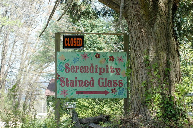
Starting with this frame, I'd crop top, bottom, and left, leaving just a little room around the sign and including the tree to the right, making it about a 2:1 panoramic, and with the arrow pointing off towards the "empty" area. You could take off the "Closed" sign, but if left on I'd title it Serendipity -- NOT! or something similar ...
Too bad you couldn't get in to shoot the stained glass.
Hi! This is an interesting catch, how serendipitous that this sign is there for the challenge, LOL!
It's a good idea but the execution of the shot and post processing or lack of is probably what did you in for the challenge. I looked at your profile and really like some of the ideas you have but it's the pulling of them off that is probably a bit fustrating to you. I know, it still fustrates the heck out of me when I can see the shot I want in my head but when it's on the screen it's not even close!
This shot has great potential and if you ever get a chance to reshoot it may I first suggest getting closer to the sign. Too much background and other items distracting you from the sign itself. For the challenge a much tighter crop on all sides would have probably helped a great deal, really making the sign the main focus of the shot. As it is right now there are trees, fences, house and all manner of things competing for my attention. Even cropping closer on the sides (putting my trusty envelopes up to the screen) makes a HUGE difference in the shot. You don't have the blow out light on the left and the darker shadow side on the right competing for your attention.
Also a touch more contrast in the shot would really make the sign pop out and bring out the colors.
If you make changes I would love to see them.
Good Luck In Future Challenges!
Deannda
DNeufer@stny.rr.com if you have any questions or want to discuss this further!
That is so cool, nice shot and timing, I think I would have chopped out most of the left, bcause it looks blown out, and adds nothing to the photo...good luck.
Well, okay, you've managed to find a sign with the word 'serendipity' which is certainly serendipidous. Outside of that, I don't see much happening in this photo on its own merit. The composition lacks a truly interesting focal point. The sign outside the realm of this assigment isn't visually compelling as the subject of this photo. In other words, I can't see anyone other than the proprietor being interested in a photograph record of it. The textural details are washed out .The sign looks like it may have some nice crackly paint textures if you had come in closer but that is really just me grasping for something positive.
What a find this must have been for you. I would maybe recommend a different angle to add a bit more interest, and the little bit of sunlight on the sign is somewhat distracting. Other than that, good job!
Sorry, I don't see how it meets the challenge. Maybe you happened to be somewhere and you got this shot, but if that's the challenge criterion, couldn't ANY picture meet the challenge?
Just your luck, they were closed. The lighting seems unbalanced with the brights to bright on the left pulling the eye away from your subject. Perhaps a more limited depth of field or closer cropping would help?






 Add photograph to your favorites
 Add photographer to your favorites

 Photographer found comment helpful.


