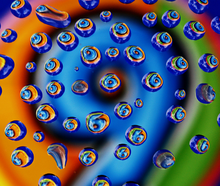
Put some drops on glass and put a piece of paper with the number 9 below it. Put blue background under the number 9 and put the glass about 10 inches above it.
Statistics
Place: 13 out of 92 Avg (all users): 6.2517 Avg (commenters): 7.1538 Avg (participants): 6.1714 Avg (non-participants): 6.2759 Views since voting: 2009 Views during voting: 387 Votes: 151 Comments: 17 Favorites: 2 (view)
Color Saturation and Hue: All are well done, colors are vibrant without being over saturated. Hues are pleasing to the eye.
Brightness and contrast: Brightness is at the right level for this type of image. Contrast is well done, nothing is overly bright or too dark.
Focus and depth of field: Focus is nice and sharp. Depth of field kept deep enough to keep the background soft and prevent overpowering the foreground, and sharp enough to be recognizeable.
This image reminds me of an old John Setzler photo. As already noted, the drops could have been done better. The misshapen and small drops distract from the well formed drops that form the sixes. Use of an eye dropper or pipette could help get you uniform drop sizes. A pattern, whether it be a sprial, or other shape might work well as opposed to the randomness here. A spiral in the same direction as the number 9 might look really good.
As is, a creative image, with some great colors and visual interest. I could see this hanging in a gallery or an office some place.





 Add photograph to your favorites
 Add photographer to your favorites

 Photographer found comment helpful.


