Guess what? I visited an old building near the hospital I go to and they have some Georgia O'Keefe prints on their walls and I have to say that it's true that your images sometimes look like they would fit in nicely with her paintings. They only had four prints but they were all very lovely.
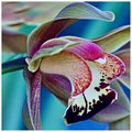
This has a lot of energy and vibrancy and the square crop still works nicely here too. If I must choose one version though, I think I prefer the duotone version... Not sure, this is a tough one :) I think the variation of tones in the petals is enhanced in the duotone version by the gradient map.
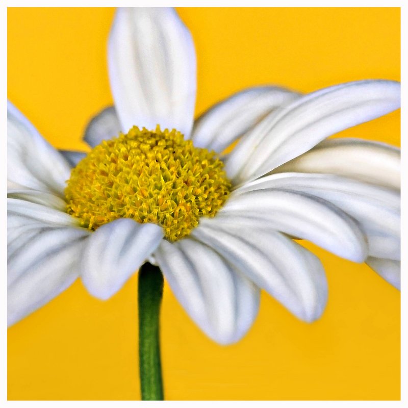
Very interesting composition. I am also a big fan of softness. I am surprised we don't see right out the other side of this flower with that power on it!





 Add photograph to your favorites
 Add photographer to your favorites


 Photographer found comment helpful.


